Prototype of a Visualization Dashboard
Over the past quarter, a functional prototype of a visualization dashboard was developed from an initial mockup. The graphical user interface was implemented as a Python application using the Trame library and is intended to run as a web-based tool in a browser. The UI design focused on intuitive, user-friendly interaction to ensure acceptance among subject matter experts.
Initial building blocks for data integration from local sources were created. When loading, the datasets are not only imported but also automatically preprocessed with category-specific filters (e.g., boreholes, simulation results). In the prototype, data sets can be highlighted, hidden, or deleted; partial edits of the active filters are possible. This allows the display format to be switched from “Surface” to “Wireframe,” as shown in the figure.
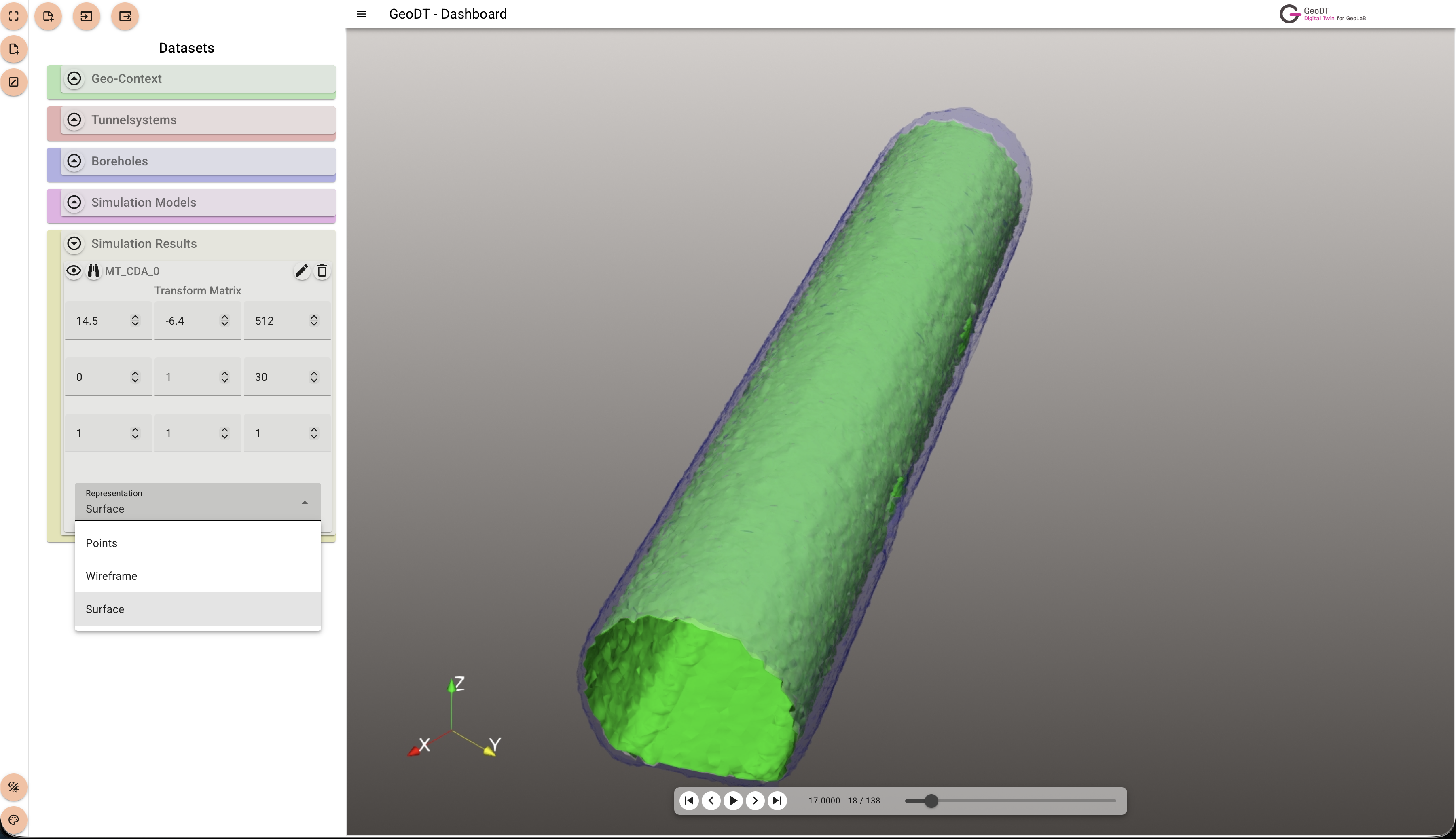
Boreholes, view towards the surface, mapped ABI data.
Initial interaction options have been integrated: Hover mode identifies individual cells or points and displays associated information. Additionally, viewpoints can be loaded and saved, facilitating the joint analysis of specific perspectives and serving as the basis for the automated creation of visualization videos generated at the UFZ using the Unity engine.