From Prototype to Interactive Visualization Dashboard
During the current quarter, the initial prototype was developed into a fully functional dashboard that now provides the six most important filter groups, such as geophysics, seismology, and hydrology, via ParaView visualization pipelines, as shown in the figure. The pipelines were designed in collaboration with subject matter and domain experts and cover the key data types central to GeoLaB, including field measurements, simulations, and planning data.
Special attention was paid to user-friendliness: Filter settings can be adjusted via a deliberately simplified interface, allowing experts to work independently without being overwhelmed by ParaView’s full functionality.
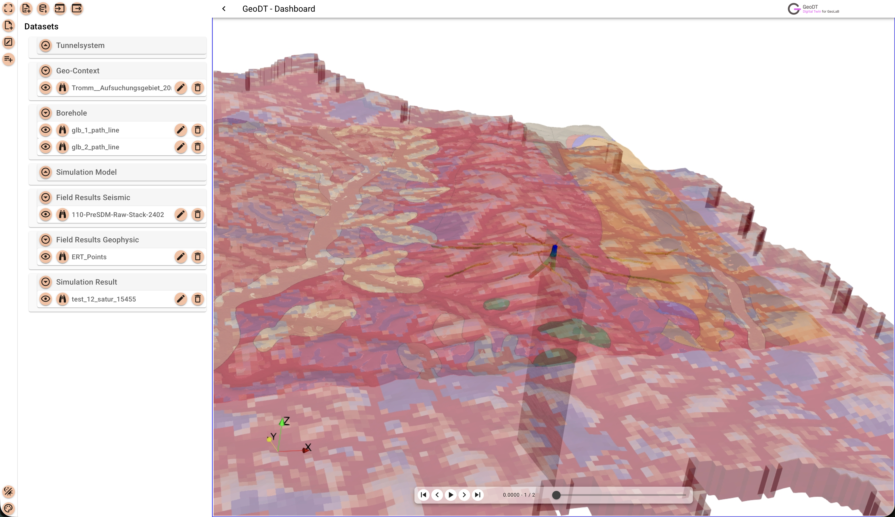
Overview of the new dashboard user interface for multiple loaded datasets.
In addition to loading local data, an interface to the Kadi database has been implemented. A new feature enables the saving and loading of configuration files (including defined viewpoints) in the compact JSON format. This makes it easy to restore analysis sessions and simplifies the exchange of information between experts.
The system has been expanded to display additional information about individual data sets, such as images, documents, or metadata, which further improves the contextualization and interpretation of the data.